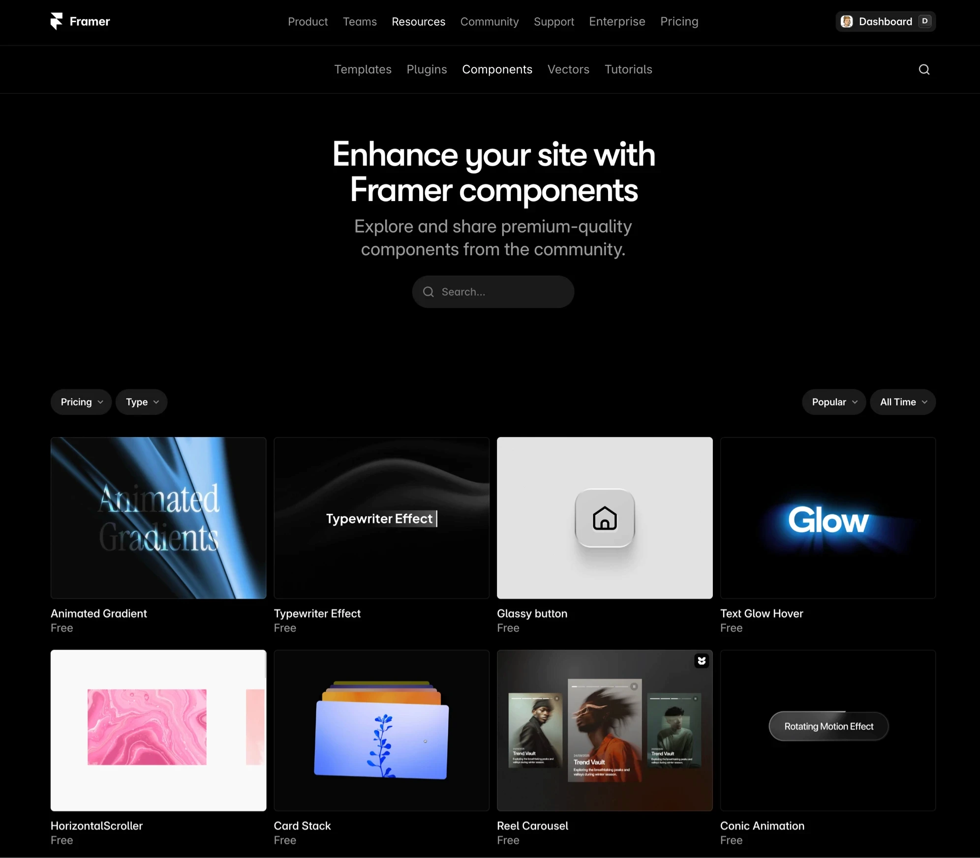
What Are Framer Components? A Complete Guide
Learn what Framer components are, how they work, and when to use them—plus real examples and best practices to build faster today.

Solt Wagner
Designer & Founder of Frameblox
Why Framer Components Suddenly Matter for Modern Sites
Websites aren’t “pages” anymore. They’re living systems—landing pages that change every week, product pages that need quick updates, and marketing sites that ship experiments like clockwork. That’s exactly why Framer components have become such a big deal: they let you build once, reuse everywhere, and update without that sinking feeling of “I’ll have to fix this in 14 places.” If you’ve ever duplicated a hero section and then regretted it later, you already understand the pain components solve.
The shift from static pages to reusable blocks
Most teams used to treat a website like a stack of individual pages: design it, publish it, move on. Now, even small teams run constant iterations—new social proof, updated pricing, seasonal promos—so the “copy/paste” approach breaks down fast. With Framer components, your site becomes a set of reusable blocks that can be swapped, upgraded, and kept consistent over time.
This shift is especially obvious when you start building a proper library of sections—think navbars, hero layouts, feature grids, testimonial sliders, and footers. If you’re building in Framer and want to move quickly without sacrificing polish, component-first design becomes the default, not a fancy extra.
What “component-first” changes in Framer
Component-first means you design for reuse from the start: you decide which parts should be customizable (text, images, colors, layout density) and which parts should stay locked for consistency. In Framer, that often means leaning into props and variants so one component can cover multiple scenarios without creating a “component graveyard.”
If you’re curious about the developer side of it, Framer’s own docs on Code Components explain how the component model extends into code, too—so you can go from visual building blocks to React-powered UI when you need it.
Who benefits most: designers, marketers, startups
Designers benefit because components protect the system—spacing, typography, and UI patterns don’t drift every time someone edits a page. Marketers benefit because they can assemble pages quickly and confidently, using pre-approved blocks that still feel flexible. Startups benefit because speed matters more than perfection, and Framer components help you ship consistently without hiring a huge team.
And if you’re building with a design system mindset—like what we focus on at frameblox.com—components are the bridge between “nice design” and “repeatable execution.”
Framer Components, Explained Like You’ll Actually Use Them
Here’s the simplest way I explain it to friends: a component is a reusable mini-design with optional settings. You make it once, then place it across your site like Lego. The magic is that you can update the source component later and those changes flow through everywhere you used it (unless you intentionally override something).
The plain-English definition
Framer components are reusable UI building blocks that can include layout, styles, interactions, and even logic. Instead of rebuilding a button, testimonial card, or pricing row every time, you create a component and reuse it. That reuse is what keeps your site consistent and makes iteration feel lightweight instead of stressful.
In my experience, the real “aha” moment happens when you realize components aren’t only for complex UI. Even simple patterns—like a section header with eyebrow text + H2 + subtitle—become dramatically easier to manage when they’re componentized.
How components differ from frames and sections
A frame is basically a container you design inside. A section is usually a chunk of layout on a page (like a hero or FAQ block). A component is different because it’s meant to be reused, customized via props/variants, and controlled from a single source. If you duplicate a section, you’ve made maintenance harder; if you reuse a component, you’ve made maintenance easier.
So the question I ask is: “Will I use this again?” If the answer is yes—even “maybe yes”—it’s often worth making it a component so you’re not stuck updating five slightly different copies later.
Where components live in a Framer project
Components live in your project’s asset structure, where you can organize them like a library. This is where a design system approach shines—grouping by category (navigation, forms, cards, sections) makes it easy to find what you need. Frameblox users often start browsing by category in Components and then narrow down to patterns they want to reuse.
If you want extra learning material beyond official docs, Best Free Framer Resources is a solid list of tutorials and references that can speed up your understanding.
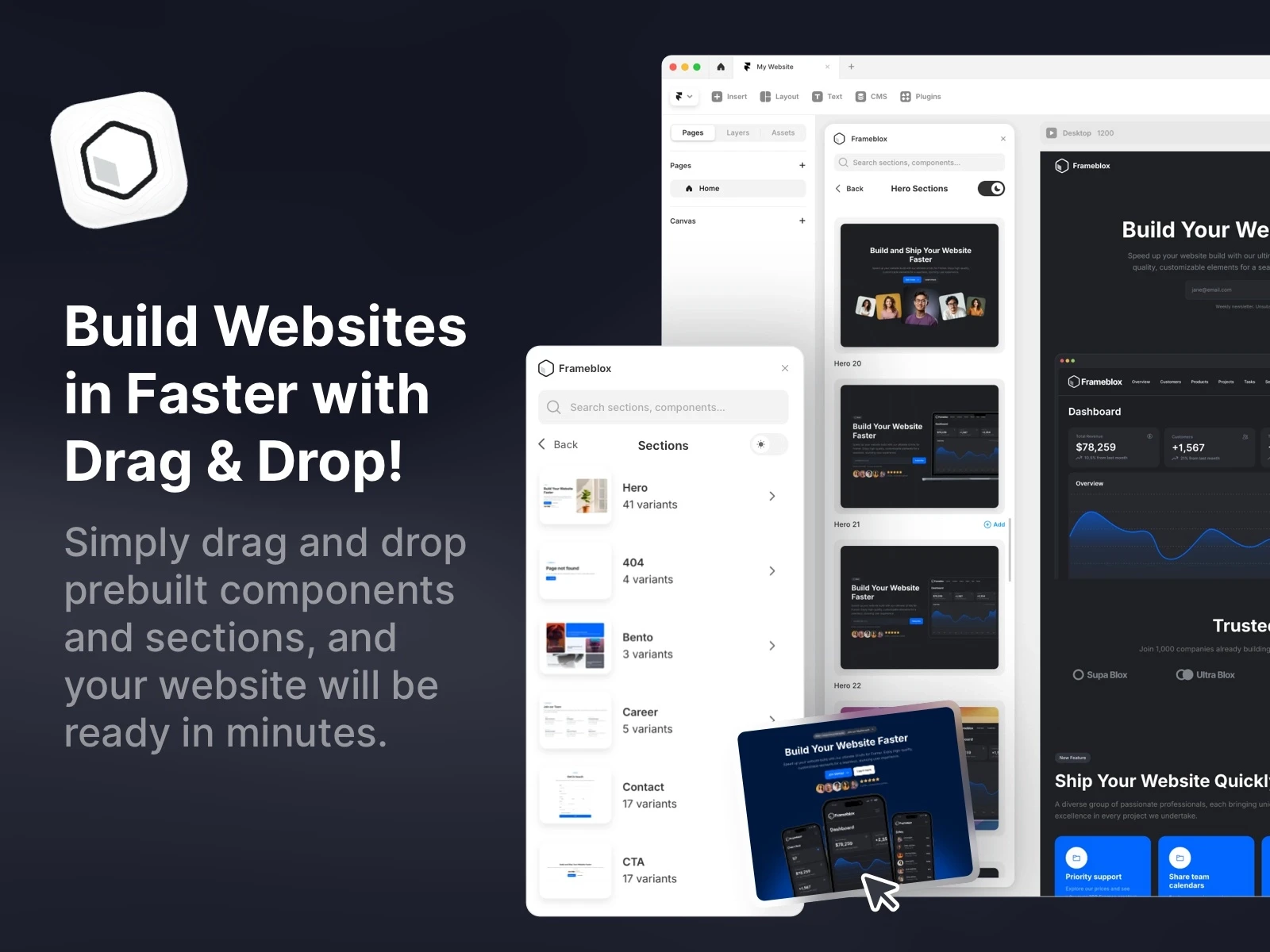
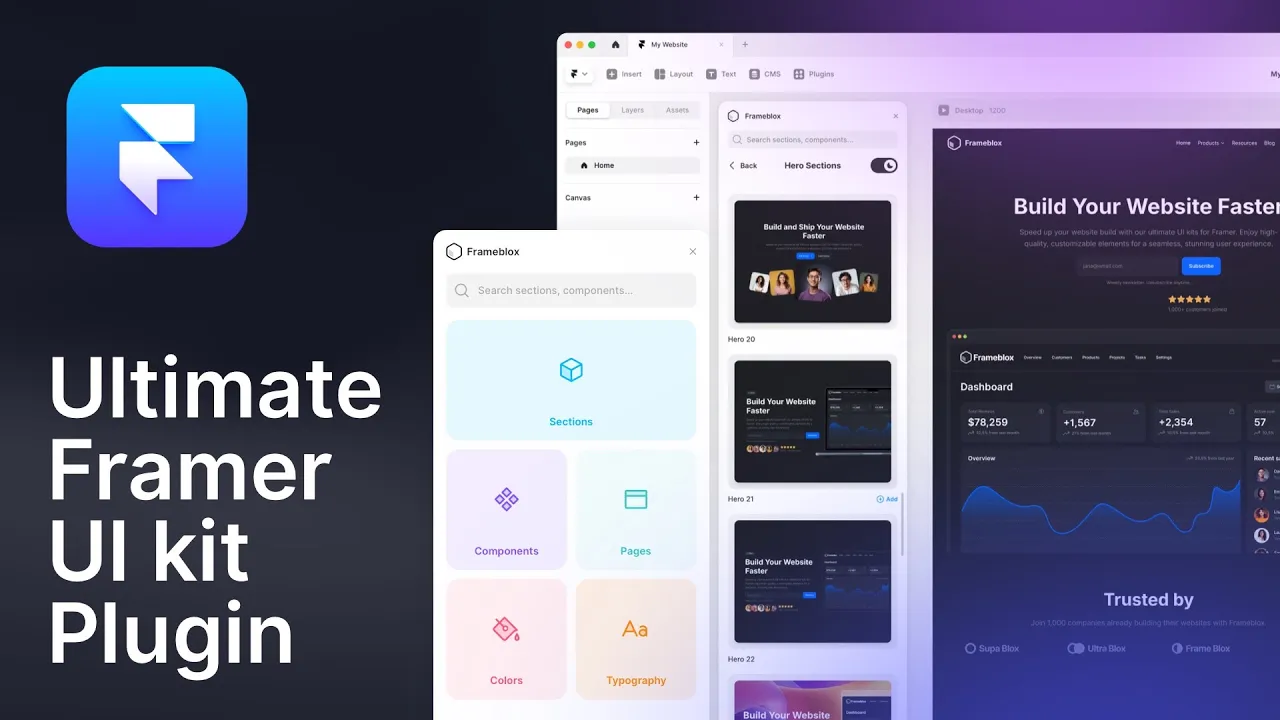
Frameblox UI kit Component Library Framer Plugin
Frameblox for Framer lets you build and launch websites faster than ever with an extensive library of drag-and-drop components, layouts, and prebuilt pages. This powerful UI kit and design system offers over 500 elements, from landing pages to contact forms, that make creating stunning, ready-to-publish sites a breeze. With features like a color and typography style generator, Frameblox is perfect for anyone looking to streamline their Framer website design process. Transform your web design experience and save hours with Frameblox!
What's included?
900+ prebuilt sections
Component Library - Browse the complete component library here
100+ prebuilt pages
Design style generator, typography and color styles
4 prebuilt Framer template
Dark and light vertsion
Regular updates
Lifetime updates
Watch the video to see how the Frameblox Plugin works in Framer
Design Websites in Minutes with Frameblox: 500+ Prebuilt Framer Components. Watch the video demo to see how you can easily build a website by simply dragging and dropping in Framer using the Frameblox plugin.
Learn more about the Frameblox Plugin here.
Supaframe
Smart widgets that don’t just look good. They run your workflow.
Supaframe helps you collect messages, bookings, feedback, and emails from your website — and manage every customer interaction from a single, simple dashboard.

The 3 Types of Components You’ll Run Into in Framer
Not all components are created equal. When someone says “component” in Framer, they might mean a purely visual block, a React-powered widget, or a layout pattern that’s designed to work with a CMS. Knowing the difference helps you pick the simplest tool that gets the job done (which is usually the best move).
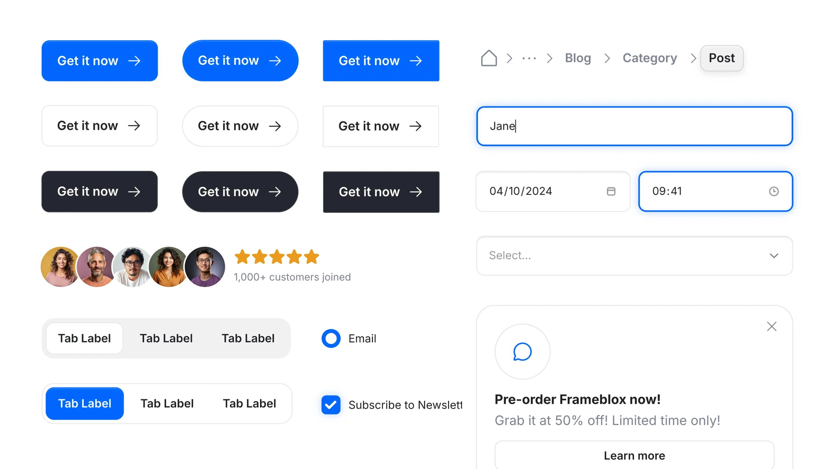
Design components (visual building blocks)
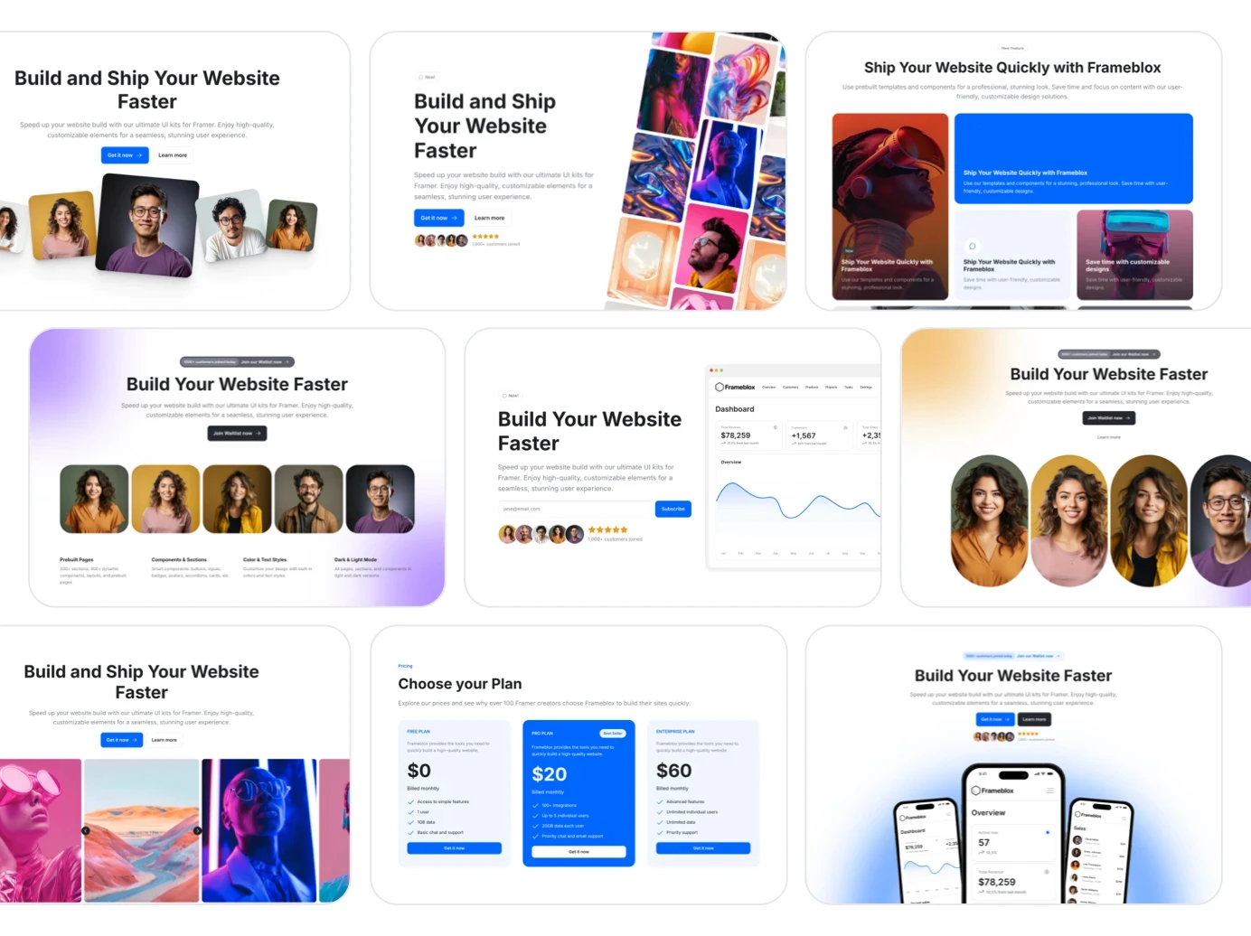
Design components are the bread-and-butter: buttons, badges, navbars, cards, icon + text rows, and full sections like hero blocks. They’re mostly visual, but they can still include interactions, hover states, and responsive behavior. For teams shipping marketing sites, these Framer components are often 80% of the system.
This is also where UI kits and libraries make the biggest difference. Instead of reinventing layout patterns, you start from a proven design system and tweak it. That’s the whole point of building with a library like All components: it reduces “blank canvas fatigue” and keeps quality high.
Code components (React-powered widgets)
Framer code components are components built with code (React), which means they can do things visual layers can’t—fetch data, integrate APIs, create advanced logic, and expose custom controls. They’re perfect when you need something truly dynamic, like a complex pricing calculator or a custom integration.
If you want a deeper look at the ecosystem around this, Framer Code Components and Code Override is a helpful reference that shows how code components and overrides fit together in real builds.
CMS-driven components (content + layout patterns)
Framer CMS components are the patterns you build specifically to be populated from collections—blog cards, job listings, changelogs, directories, and testimonial grids. The component becomes a “template” for how each item should look, while the CMS feeds it content. This is where Framer starts feeling like a real site-building system, not just a design tool.
The key idea is separation: your layout stays consistent, and your content updates safely. That’s how you scale publishing without slowly breaking spacing, typography, and structure.
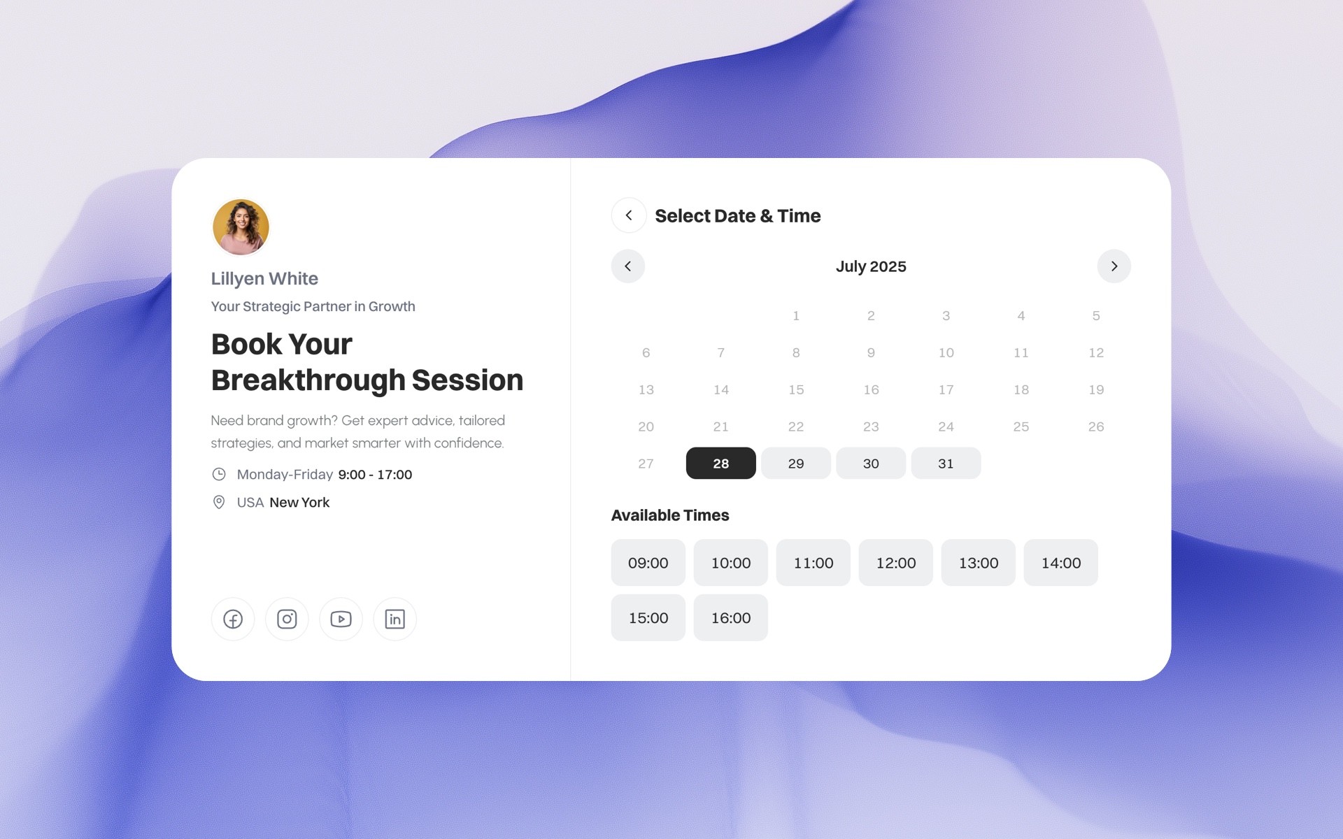
Appointment booking component - Let people book you in 30 seconds
Add a fully functional booking system to any website — with a native Framer code component included. Customize the design, embed it anywhere, and manage every booking from one clean Supaframe dashboard. No plugins. No backend. No friction. Best for: consultants, agencies, coaches, studios, and service-based businesses that want fewer emails and more confirmed bookings.
Get your Booking component from Supaframe.io
Anatomy of a Great Component: Props, Variants, and Overrides
A good component feels almost invisible. You drop it in, tweak a couple settings, and it fits perfectly—without you touching 40 layers or detaching it into a one-off mess. That “it just works” feeling usually comes down to three things: Framer component props, Framer component variants, and thoughtful overrides.
Props: turning one design into many
Props are the settings you expose so the component can adapt: text, images, icons, links, alignment, density, and sometimes layout toggles. When you define props well, one component can power a dozen use cases without duplication. That’s how you keep your library lean while still giving pages variety.
I’ve found it helps to be opinionated here. Don’t expose every possible control—only the ones someone genuinely needs when assembling pages. Too many props makes a component feel like a cockpit instead of a simple building block.
Variants: states like hover, active, loading
Framer component variants let you define “states” of the same component, like default/hover/pressed for a button, or idle/loading/success for a form. Variants are also great for layout modes, like a “compact” card vs a “detailed” card. You’re basically saying: this is the same component, just in a different state.
Where people get tripped up is creating too many variants without a clear naming system. Keep them purposeful, and you’ll get the best of both worlds: fast edits and consistent UI behavior.
Overrides: last-mile customization without rebuilding
Overrides are your escape hatch when you need a tweak without rebuilding the whole component. Maybe one landing page needs the hero button to say something slightly different, or one section needs a unique background treatment. Overrides let you customize “at the edge” while keeping the component connected to its source.
If you want a more developer-leaning discussion, the community thread More extensive developer docs? - Framer is a good place to see how people handle edge cases and advanced setups.

Building Your First Reusable Component Without Overthinking It
The fastest way to get comfortable with Framer components is to build one that solves a real, repeatable problem on your site. Not a hypothetical “someday” component—something you’re already duplicating right now. Keep it small, useful, and slightly opinionated, and you’ll feel the payoff almost immediately.
Start with one repeatable UI problem
Pick something you’ve already used at least twice: a button style, a section header, a feature card, or a testimonial layout. If you’re building a SaaS marketing site, a “feature row” component is usually a great first win because it appears everywhere. Create it once, then replace duplicates with your component.
If you want inspiration, browsing curated blocks can help you spot repeatable patterns. Frameblox categories like Base are useful because they show the “foundational” blocks that most sites reuse constantly.
Set smart defaults and constraints
Defaults are underrated. Set typography, spacing, and layout so the component looks good the moment it’s dropped onto a page. Constraints matter too—like limiting line length, controlling padding ranges, and defining responsive behavior—because they keep the component from breaking when someone edits it quickly.
The goal is to make the “right” output the easiest output. That’s how a design system actually protects your site while still letting people move fast.
Name, organize, and document as you go
Naming sounds boring until you have 80 components. Use a simple convention like “Button / Primary” or “Card / Testimonial” so search is painless. Keep related components grouped so you’re not hunting for basics every time you build a new page.
If you’re exploring the code side, Code Components in Framer is a practical guide that helps connect the concept of reusable components to the code component workflow.

Blogie — Blog smarter in Framer
The Blogie Framer Plugin lets you generate, publish, and sync high-quality, SEO-ready blog posts directly from Framer. Write or update content with AI, publish in one click, and keep your blog fast, clean, and perfectly integrated with your Framer site.
The Blogie.ai Framer Plugin adds Blogie AI’s SEO and content intelligence directly to your Framer site. Instead of guessing what to write, Blogie connects with Google Search Console to analyze real search data and surface keyword opportunities that can improve your rankings. Based on these insights, Blogie recommends article ideas, titles, and angles—so you always know what content to publish next.
Blogie AI handles keyword research, SEO optimization, and content generation automatically. You can write and edit human-sounding, SEO-ready articles, refine sections or tone, and schedule posts to publish on your Framer site exactly when you want. With automated publishing and flexible scheduling, Blogie helps you stay consistent without manual work—publishing content as often as you choose, on autopilot. The result is a faster, data-driven way to create, optimize, and publish blog content in Framer that’s built to rank on Google.

Features
Google Search Console integrationAnalyze real search data to uncover keyword opportunities and ranking improvements.
Keyword-driven article recommendationsGet AI-powered suggestions on what to write next based on keywords that can boost your Google rankings.
AI-powered SEO content writingGenerate high-quality, human-sounding, SEO-optimized articles with Blogie AI.
Effortless content editing and refinementRewrite sections, adjust tone, expand ideas, or improve clarity with instant AI edits.
Automated publishing to FramerPublish articles directly to your Framer site with one click or on a scheduled basis.
Flexible scheduling & content automationSet your own publishing cadence and let Blogie publish content automatically.
Built-in SEO optimizationAutomatic meta tags, keyword placement, and SEO best practices applied to every article.
Data-driven content workflowTurn real performance data into actionable content ideas—no guessing, no spreadsheets.
Humanized AI contentContent designed to sound natural and readable, not generic or “AI-written”.
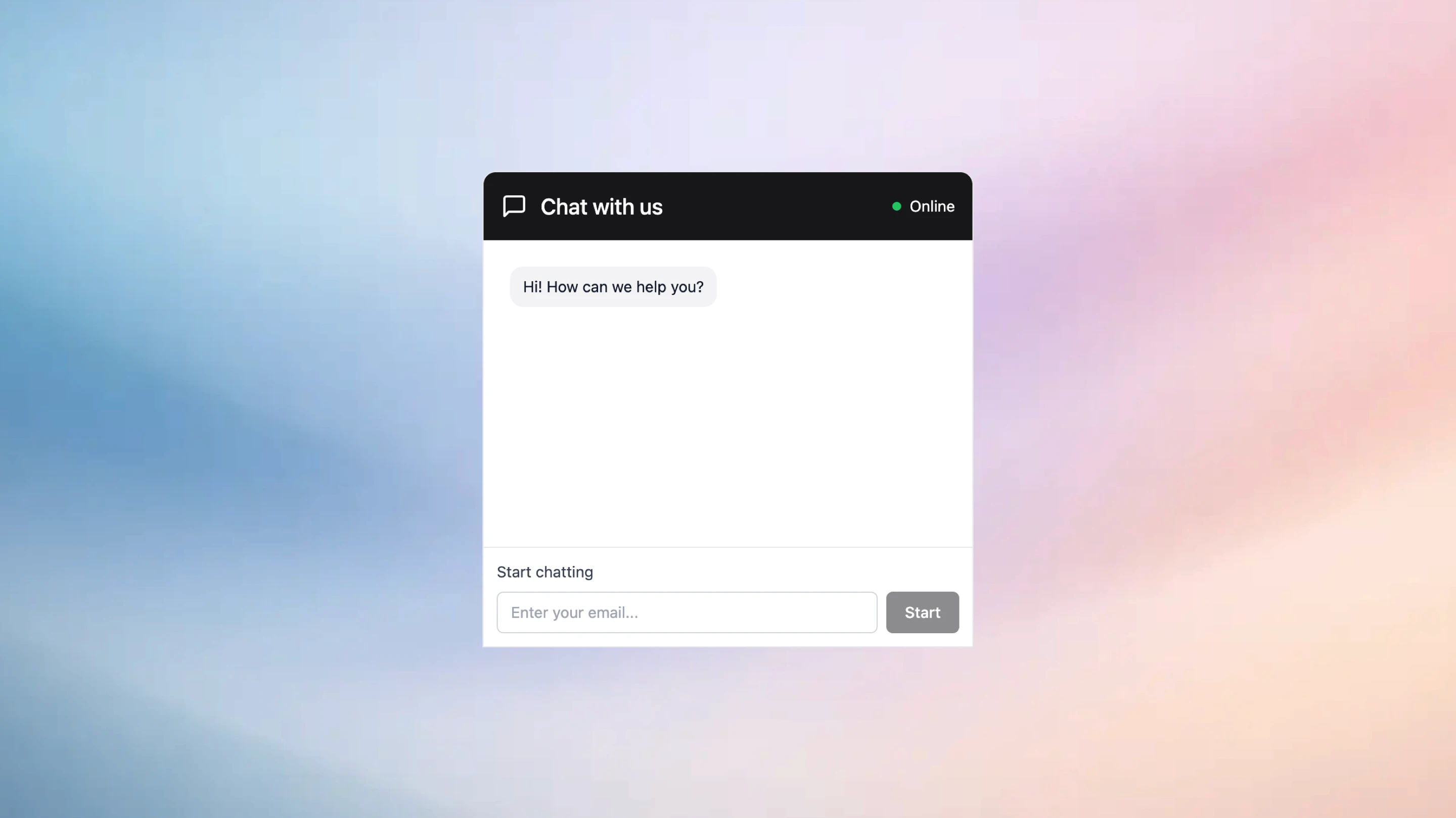
Chat component - Answer questions before visitors bounce.
Add a real-time chat widget to any website — with a native Framer component available. Let visitors message you while they’re on your site, then manage every conversation from one unified Supaframe inbox. Reply faster, keep context, and turn more visits into real conversations. No plugins. No backend. Just conversations that convert.
Get your Chat component from Suapframe.io
When to Use Code Components (and When Not To)
I like code components, but I’m also careful with them. Framer code components are powerful, and that power is exactly why you should be selective. The best rule I’ve heard is: if a visual component can do the job cleanly, start there. Bring code in when you need true logic, data, or customization you can’t get otherwise.
Signals you need real logic or data
If your component needs to fetch data, handle complex user input, integrate with external APIs, or perform calculations, you’re in code component territory. Another big signal is when behavior depends on conditions—like “if plan is annual, show discount label,” or “if user selects X, animate Y and load Z.” That logic becomes messy fast in purely visual setups.
Code components also shine when you want to package a repeatable “widget” for multiple pages, like a signup form connected to your backend or a dynamic pricing switcher.
Performance and complexity tradeoffs
More logic can mean more complexity, and complexity has a cost: debugging time, maintenance, and sometimes performance overhead. The best code components are focused and well-scoped, with a clean set of controls exposed to the editor. If you build a code component that tries to do everything, you’ll spend more time maintaining it than using it.
I’ve found it’s better to build two simple components than one mega-component with 30 controls and unpredictable edge cases.
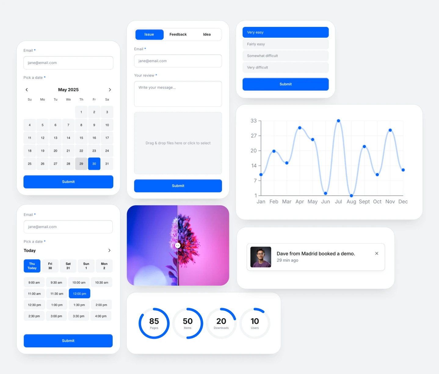
Common use cases: forms, sliders, integrations
Forms are a classic win: validation, submission handling, success/error states, and integrations (email tools, CRMs, databases). Sliders, carousels, and advanced animations can also be great use cases when you want a very specific interaction. Integrations—like pulling testimonials from an API or embedding a custom scheduler—often need code to feel seamless.
If you want examples of component categories that often pair with code enhancements, check out Code in the Frameblox library for patterns that are designed to be practical on real marketing sites.

Supaframe
Smart widgets that don’t just look good. They run your workflow.
Supaframe helps you collect messages, bookings, feedback, and emails from your website — and manage every customer interaction from a single, simple dashboard.
Your data, always organized — all in Supaframe.
Every component, every submission, all in one powerful dashboard. Supaframe helps you collect, track, and manage real customer data — without the chaos.
Booking component
Email collector component
Contact component
Poll component
Testimonial component
Chat component
Copy and paste smart Framer components to your website
Making Components Play Nicely With CMS Collections
Once you start publishing content at scale—blog posts, changelogs, case studies, job listings—your component strategy changes. You’re no longer designing for one page; you’re designing for a system that outputs many pages consistently. That’s where Framer CMS components really earn their keep.
Mapping CMS fields into component props
Think of CMS mapping as connecting “content slots” to “design slots.” Your CMS might have fields like title, subtitle, category, author, thumbnail, and publish date. Your component should expose props that mirror those needs, so mapping feels obvious and frictionless.
I like to keep the design flexible but guarded: let editors change text and images through the CMS, but keep spacing, typography styles, and layout structure controlled by the component.
Repeaters, lists, and dynamic grids
Lists and grids are where CMS-driven design can either look effortless or fall apart. Build a component pattern for cards (or rows) that works across a variety of content lengths, then place it inside a repeatable grid. If your card breaks when a title runs long, you’ll end up “fixing content to match the design,” which is backwards.
A practical trick: test with worst-case content—long titles, missing images, short excerpts—before you commit the component to your library.
Keeping content editors safe with guardrails
Guardrails are how you keep a site consistent even when multiple people touch it. Use clear prop names, limited variant options, and sensible defaults so editors can’t accidentally create an off-brand layout. If someone can pick between “Small / Medium / Large” spacing instead of a freeform slider, your design system stays intact.
This is also where prebuilt section libraries help: if the starting point is solid, editors are less likely to improvise risky layouts just to ship a page quickly.
Speed Wins: How Components Shrink Build Time and Maintenance
Speed isn’t just about moving fast once—it’s about staying fast after your site grows. Every new page, campaign, and update adds weight. Done right, Framer components reduce that weight because they turn site-building into assembly, not constant redesign.
Reducing duplicate design work
Duplicate work is the silent killer of small teams. If you rebuild the same card layout five times, you’re also signing up to maintain five versions. Components eliminate most of that by letting you reuse a single source of truth.
That’s why a component library like Frameblox can be such a force multiplier. When you have hundreds of ready-to-use blocks, you spend your time tailoring and improving—not recreating basics from scratch.
Safer site-wide updates in minutes
One of the best feelings in a component-first workflow is updating something once and watching the whole site improve. Want to adjust button padding, change a type scale, or update border radius across pricing cards? Update the component source, and you’re done. That’s the kind of change that used to take hours of page-by-page cleanup.
This matters a lot for SaaS teams where messaging shifts frequently—pricing changes, feature names evolve, and “new” becomes “improved” overnight.
Consistency that doesn’t kill creativity
Some people worry components make everything look the same. I get it—but I think it’s mostly a misuse problem. Components create consistency in the fundamentals (spacing, typography, UI patterns), which actually gives you more room to be creative where it counts: layout composition, storytelling, and visual emphasis.
In practice, you can have a consistent system and still build pages that feel unique by combining Framer component variants, strong content, and a few intentional “hero moments.”

Common Mistakes That Make Framer Components Feel “Messy”
I’ve opened projects where the component panel looks like someone emptied a junk drawer onto the canvas. The good news: messy component systems are usually fixable, and the patterns that cause the mess are pretty consistent. Cleaning them up makes your site faster to build, easier to update, and way less stressful to hand off.
Over-componentizing everything
Not everything needs to be a component. If a block appears once and is unlikely to repeat, making it a component can add overhead without payoff. You’ll spend time naming, organizing, and maintaining something that never actually saves you time later.
A simple filter: componentize the things you reuse, the things that affect branding, and the things that should stay consistent (buttons, headings, cards, nav elements). Leave one-off art direction sections as custom layouts.
Too many variants, not enough clarity
Variants are amazing until you have 14 of them with names like “v2-new-final-FINAL.” That’s where teams get stuck. If a component has too many variants, it becomes harder to choose the right one and easier to misuse the system.
Try to keep variants to meaningful states and layout modes: “Default/Hover/Pressed,” “Light/Dark,” “Compact/Spacious.” If you need something wildly different, it might be a new component, not a new variant.
Ignoring naming conventions and structure
Names are a UI for your team. If your component names are inconsistent, nobody can find anything, and people start duplicating components instead of reusing them. That’s how a system slowly collapses into duplicates and near-duplicates.
A clean structure helps a lot: categories like “Nav,” “Buttons,” “Cards,” “Sections,” and “CMS” make searching easy. If you want an example of category-driven browsing, Frameblox splits patterns into areas like Styles and layout-focused collections so you’re not scrolling endlessly.
Real-World Component Patterns You Can Copy Today
Patterns are where Framer components become practical. You don’t need a huge library on day one—you need a small set of components that cover the highest-impact parts of your site. Below are patterns I’ve seen work across SaaS landing pages, product sites, and template-based builds.
Buttons, navbars, and hero sections
Start with the essentials: a button set (primary, secondary, text), a navbar with a couple layout options, and at least one hero component that supports different messaging lengths. These show up everywhere, and inconsistencies here are extremely noticeable. Make them solid, and the whole site feels more intentional.
If you want quick examples to pull from, check out collections like Bento for modern layout patterns, or browse How It Works sections that commonly appear on SaaS pages.
Cards, pricing tables, and testimonials
Cards are the backbone of marketing sites: features, blog posts, integrations, team members, and more. Build a card component with a couple variants (icon-top, icon-left, image-top) and you’ll reuse it constantly. Pricing tables are similar—make sure toggles, badges, and “most popular” styles are baked into your variants.
Testimonials are a sneaky one: people copy them all over a site. A reusable testimonial card (with optional avatar, role, company logo, and rating) prevents tiny style drift that makes a site feel inconsistent.
Modals, banners, and notification toasts
These components are less visible until you need them—then you need them fast. A banner component helps with promos, announcements, and product updates without hacking a one-off section each time. Modals are great for email capture, demo requests, and contextual explanations, especially when paired with clean states like open/closed and success/error.
If you’re building a library for a team, it’s worth including these “utility” components early. They save your future self a surprising amount of time.
What People Often Wonder About Framer Components
Once you start using Framer components regularly, the questions get more practical: sharing across projects, SEO, performance, and how this all compares to Figma. These aren’t theoretical questions—they’re the ones that matter when you’re building a real SaaS site that needs to ship and rank.
Can components be shared across projects?
Yes, but the “best” method depends on your workflow. Some teams duplicate a project as a starter kit so the component library comes along, while others rely on copy/paste workflows from a central library. If you’re working with a UI kit like Frameblox, the whole point is fast reuse—Frameblox Pro users can copy and paste sections into their own builds, which feels like sharing a component library without heavy setup.
If you’re maintaining multiple brands or microsites, consider keeping a base project that acts as your source-of-truth system, then fork new sites from it.
How do components affect SEO and performance?
Components themselves aren’t “bad for SEO.” What matters is the output: clean structure, proper headings, readable content, and good performance. A component-first approach can actually improve performance over time because it encourages consistency and avoids messy, duplicated layouts that bloat pages.
Performance comes down to choices: too many heavy effects, unoptimized images, or overly complex Framer code components can slow things down. The component model just makes it easier to fix issues globally once you spot them.
What’s the difference vs Figma components?
Figma components are design artifacts; Framer components are production site-building blocks. Figma helps you design and document patterns, but Framer components carry those patterns into a live website with real responsiveness, interactions, and CMS connections. If you’ve ever had “design drift” between Figma and the shipped site, Framer components are one of the best ways to reduce it.
In practice, teams often use Figma to explore and Framer to operationalize—where the component becomes the real, reusable unit that ships.
Your Next 30 Minutes: A Simple Plan to Component-ize Your Site
If you’ve read this far, you’re probably ready to actually do something—not just understand the theory. Here’s a simple 30-minute plan I’ve used to turn a messy Framer project into a cleaner, faster system. It’s intentionally small and realistic, because the goal is momentum, not perfection.
Audit: find repeats and inconsistencies
Spend 10 minutes scanning your pages and writing down repeated patterns: buttons, section headers, feature cards, testimonial blocks, nav elements, and footers. Pay attention to inconsistencies like slightly different font sizes, padding, or border radius—those are your top candidates for components. This is where you’ll get the biggest ROI from Framer components quickly.
If you want a shortcut, compare a few prebuilt libraries to your current site. Browsing a structured collection like 404 or About sections can reveal gaps in your own system you didn’t notice.
Build: create a mini component library
In the next 10 minutes, build 3–5 components that cover the biggest repeats: a button, a section header, a card, and one “hero-ish” section. Add only the props you truly need (text, link, image, variant), and set defaults that look good without tweaking. If you’re using Framer component props well, these blocks should feel fast and friendly to reuse.
If you’re starting from a UI kit, don’t fight it—lean into it. For example, you can use Frameblox as your base system and then adapt components as your product and brand evolve. Even the Old Home can be a useful reference point for how layout patterns can be organized and reused.
Maintain: rules for adding and updating components
Use the last 10 minutes to set simple rules: name components consistently, limit variants to meaningful states, and avoid creating new components when a variant or prop would do. Decide what can be overridden and what should stay locked, so your system doesn’t slowly drift into chaos. This is also where you define your stance on code: only build Framer code components when you need real logic, not because it feels more “advanced.”
If you want a practical next step after that, pick one page you’ll rebuild entirely using your new components. Then compare build time and edit time. The difference is usually obvious—and once you feel it, it’s hard to go back.
Quick next steps if you’re building with Frameblox:
Browse Components and save 10 patterns you use constantly (hero, nav, cards, testimonials).
Start from All if you want speed, or narrow into categories like Styles for system-level consistency.
If you’re timing purchases around promos, keep an eye on Framer Black Friday deals so you can expand your component library when it’s most cost-effective.
If you do nothing | If you component-ize |
|---|---|
More copy/paste sections and slow updates | Reusable Framer components and faster edits |
Inconsistent spacing and typography drift | A clearer Framer design system that holds up over time |
Harder CMS scaling as content grows | Stronger Framer CMS components that protect layout |
This article was created using Blogie.


