Best Framer Templates: 10 Free Places to Start
Explore 10 free Framer template sources and categories—portfolio, creative, services, news, community, and more—to launch faster with Framer.

Solt Wagner
Designer & Founder of Frameblox

Start Faster with Framer Templates (and Where to Look First)
If you’ve ever stared at a blank canvas and thought, “I know what I want… I just don’t want to build it from scratch,” you’re exactly who Framer templates are for. With the right starting point, you can go from “idea” to “live site” shockingly fast—especially if you’re pairing a template with a component library and design system like frameblox.com.
What you can build quickly with Framer templates
Framer templates are a shortcut to structure. Instead of manually creating a layout, navigation, page sections, and responsive behavior, you start with something already cohesive. That’s perfect for:
Portfolios that need case study pages, project grids, and a clean “About” section
Service sites that need clear offerings, testimonials, process sections, and contact flows
Creative showcases where visuals and interactions do the talking
News/publishing-style sites with lists, featured stories, and multi-page navigation
Community sites that feel like a hub, not just a landing page
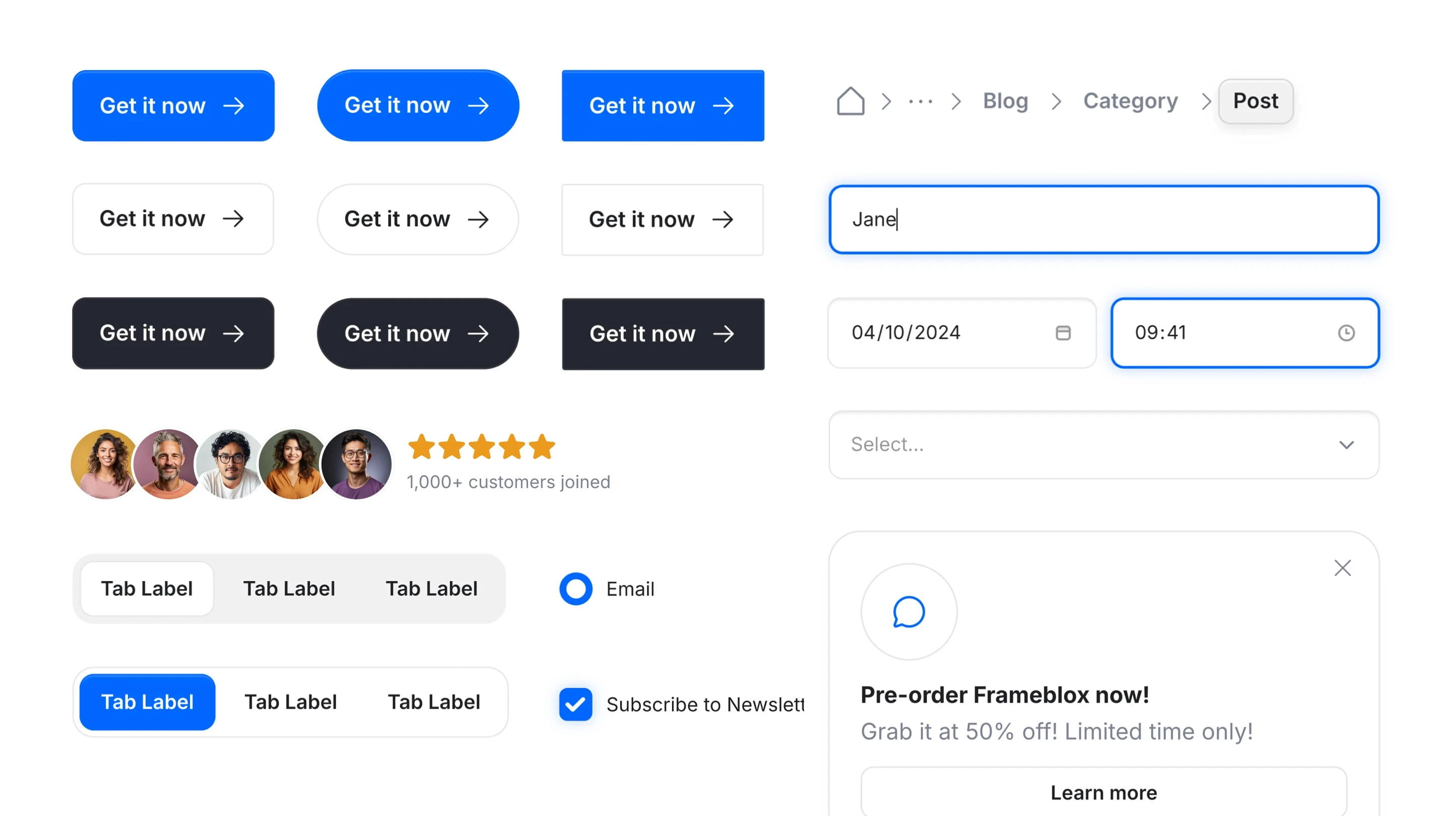
Then you layer in your own “brand system” (type scales, spacing rules, buttons, cards, and repeatable sections). If you’re building in Framer and want consistency, it helps to have ready-to-go blocks like the ones in Components—especially when you’re editing a template that wasn’t originally designed with your exact product in mind.
How to decide between browsing categories vs. browsing everything
When you’re hunting Framer templates, you’ve got two mindsets:
“Show me everything.” Great when you’re exploring and don’t have a strong direction yet.
“I know what I’m building.” Better when you want to move fast—go straight to the category that matches your site type.
If your goal is speed (and it usually is), category browsing tends to win. It’s easier to compare like-for-like designs and narrow down your shortlist.
A simple workflow: pick a template, customize, publish
Here’s the workflow I recommend if you want fewer rabbit holes and more launching:
Pick a template that matches your site type (portfolio/services/news/community) and general vibe.
Customize structure first: pages, navigation, section order, and what the site “needs” to say.
Then style it: colors, typography, spacing, and components. This is where a design system helps—check out Styles if you want a more system-driven approach.
Publish, then iterate. The best sites aren’t perfect on day one—they’re shipped and improved.
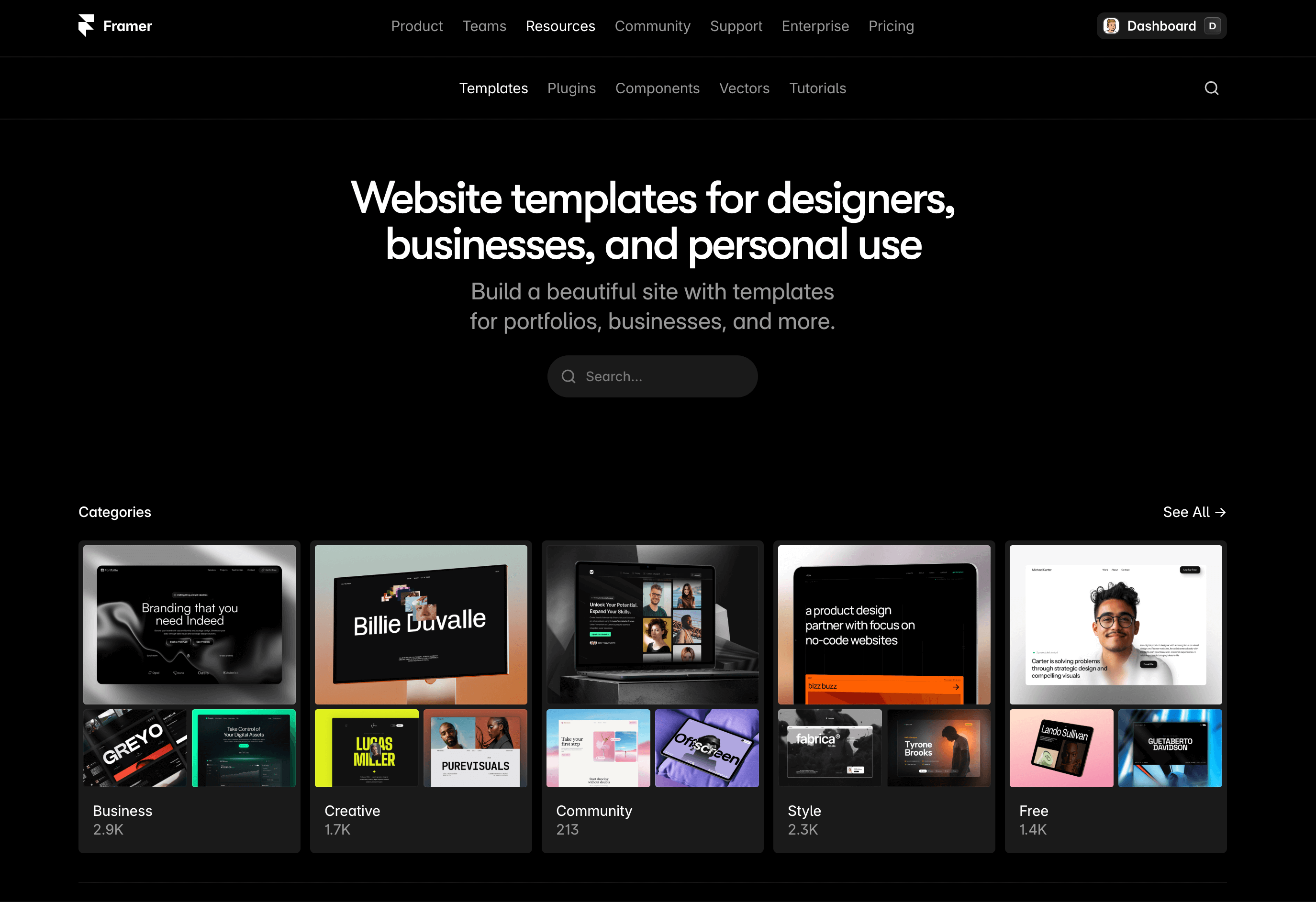
Framer Marketplace
If you’re looking for the “official front door” to Framer templates, Framer Marketplace (by Framer) is it. It’s free to browse, and it’s where Framer keeps templates and plugins in one place—so you’re not hopping between random directories or questionable downloads.
Features: templates and plugins in one place (free)
What I really like about the Marketplace is that it’s centralized. You’re not just picking from Framer website templates; you’re also seeing plugins alongside them. Even if you start with a template, plugins can help you extend what your site can do or speed up certain tasks as you build.
Use case: browse templates and plugins
The core use case is simple: open the Marketplace, scan what’s available, and pick the best starting point. If you’re building a marketing site for a SaaS (like Frameblox), this is a solid way to find a baseline layout, then plug in your product story and design system.
Pros/cons: centralized discovery vs. lots of options to sift through
Pro: Everything is in one official hub, which saves time and reduces risk.
Con: It can feel like “too much choice.” You’ll still need a filtering mindset or you’ll end up opening 20 tabs and forgetting what you liked.
Who it’s for: anyone starting from the official Framer hub
If you’re new to Framer templates, start here. It’s the safest, most straightforward launchpad—especially when you’re pairing a template with a consistent component toolkit (for example, using prebuilt blocks like All to rapidly swap in sections that match your brand).
Supaframe
Smart widgets that don’t just look good. They run your workflow.
Supaframe helps you collect messages, bookings, feedback, and emails from your website — and manage every customer interaction from a single, simple dashboard.
Responsive HTML Website Templates (Framer Templates Directory)
Inside the Marketplace, there’s also a dedicated template listing: Responsive HTML Website Templates. Create a ... - Framer (by Framer). This is the “templates-only” browsing experience, which I honestly prefer when I’m in build mode and don’t want plugin distractions.
Features: dedicated templates listing inside the Marketplace (free)
This directory keeps your focus on Framer website templates. It’s still free to browse, but it feels more direct: you’re here to pick a layout, not explore tools.
Use case: find website templates
If your goal is to launch a marketing site quickly—say you’re creating a landing page for a new Frameblox feature, or a special promo page like Framer Black Friday—this templates directory is a fast route to “something publishable.”
Pros/cons: focused on templates vs. may still require filtering to match your niche
Pro: More focused than the full Marketplace—less noise.
Con: You’ll still have to filter mentally. A template can be beautiful but wrong for your actual site goals (like trying to force a portfolio layout into a services funnel).
Who it’s for: people who want to browse templates specifically (not plugins)
If you’re already committed to using a template and just want to pick one, this is the page I’d bookmark. Then once you choose, you can upgrade the “template look” into a cohesive system by swapping in standardized sections—things like consistent “How it works” blocks from How It Works can make even a generic template feel like a real product site.
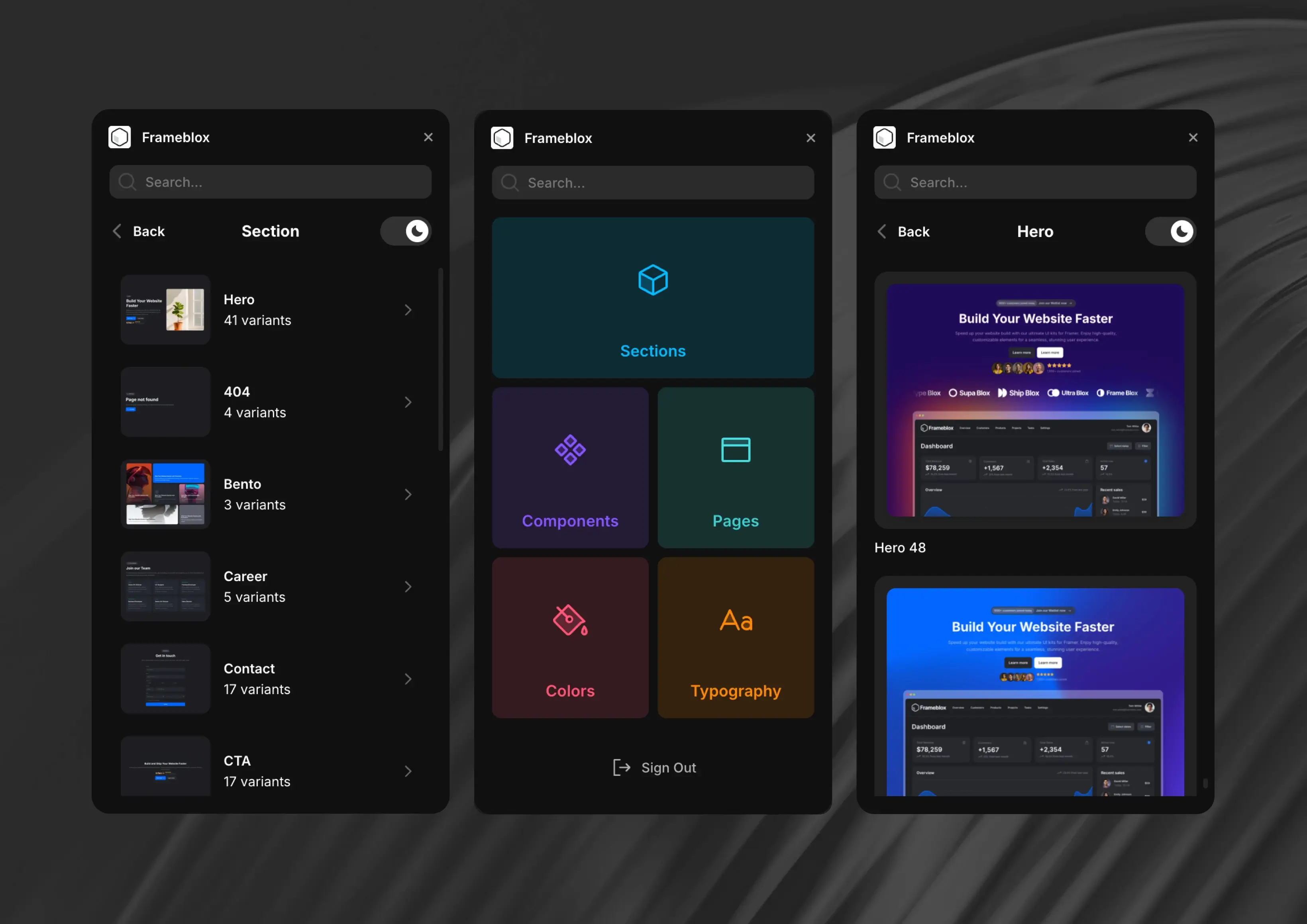
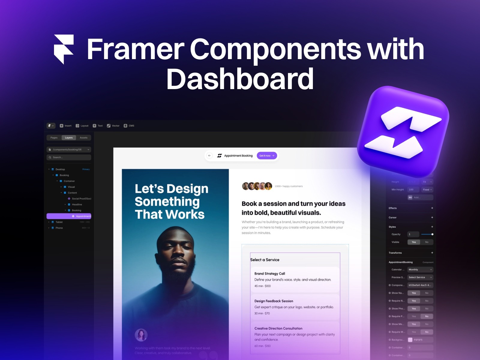
Ultimate UI Kit Component Library for Framer - Frameblox
Frameblox for Framer accelerates website creation with a vast library of over 500 drag-and-drop components, layouts, and prebuilt pages. This powerful UI kit includes everything from landing pages to contact forms, simplifying the design process. With features like a color and typography style generator, Frameblox helps streamline and transform your web design experience, saving you hours.
What's included?
600+ prebuilt sections
Component Library - Browse the complete component library here
50+ prebuilt pages
Design style generator, typography and color styles
2 prebuilt Framer template
Dark and light vertsion
Regular updates
Lifetime updates
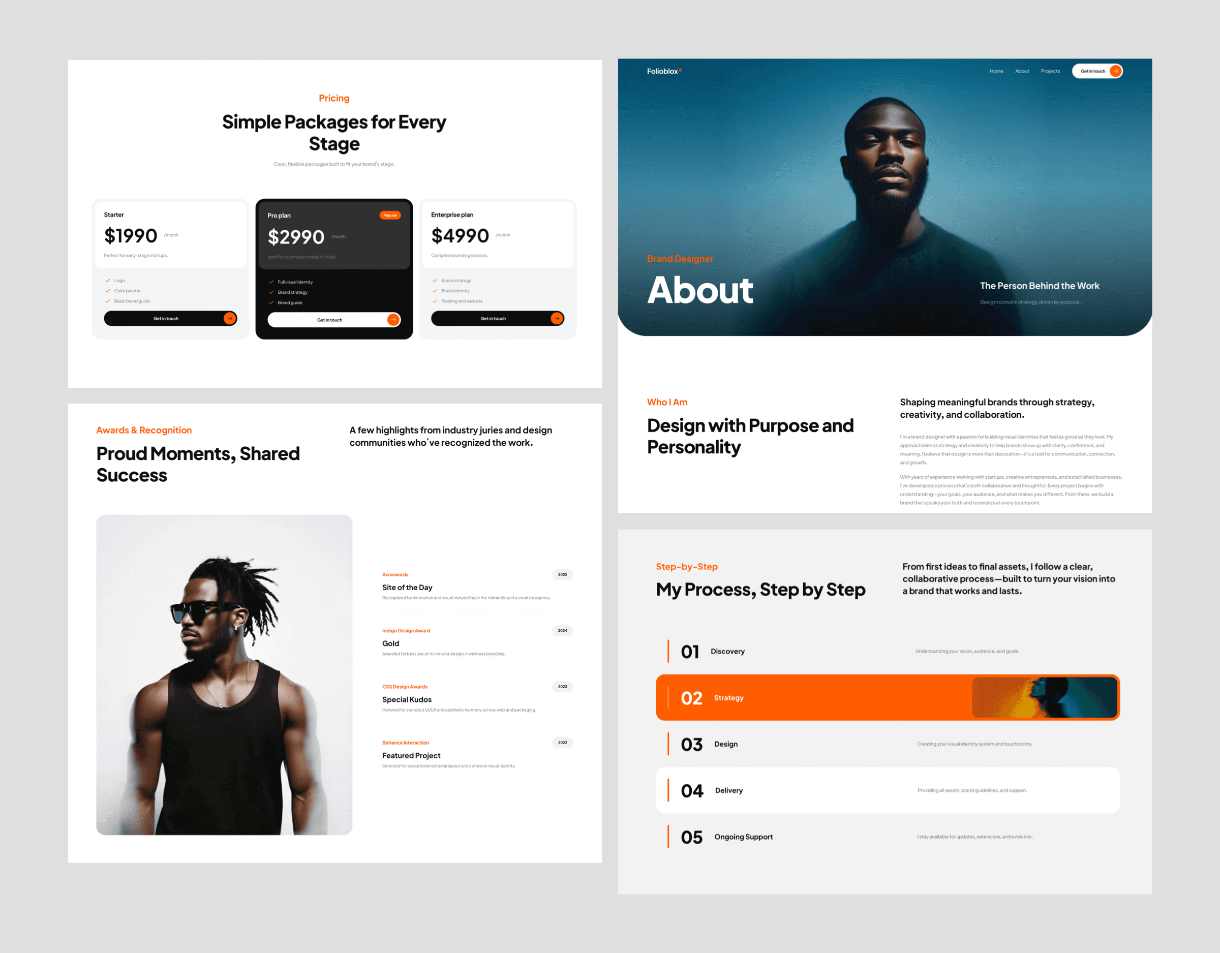
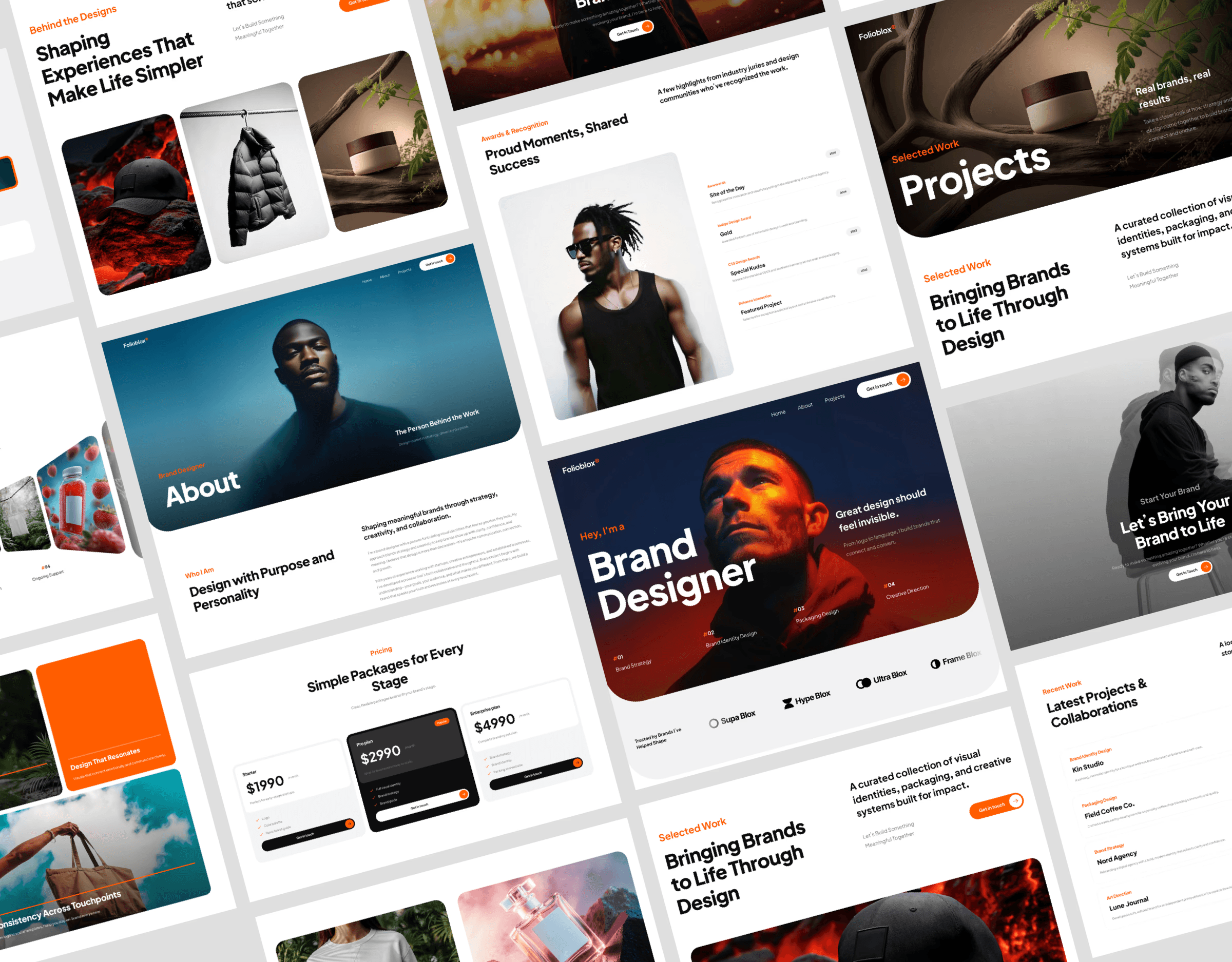
Free Portfolio Website Templates (Portfolio Category)
Portfolio sites are one of the most common reasons people look for Framer templates, and the category page Free Portfolio Website Templates & Responsive Landing ... (by Framer) is a clean way to narrow the search fast.
Features: portfolio-focused layouts (free)
Portfolio templates tend to emphasize projects, visuals, and case-study storytelling. You’ll typically see strong gallery layouts, project cards, and pages that are built for “show, don’t tell.” If you’re a designer, creator, or freelancer, these templates cut out a ton of structural work.
Use case: showcase portfolio work
Use this category when the main goal of your site is credibility through work samples. That could be personal work, client projects, experiments, or even product screenshots and “feature breakdown” pages.
Pros/cons: great for projects/case studies vs. less suited for complex business sites
Pro: Perfect for case studies and visual storytelling.
Con: If you need complex marketing flows (multiple conversion paths, lots of feature pages, heavy product education), portfolio templates can feel thin unless you add sections.
Who it’s for: designers, freelancers, and makers building a portfolio
If you’re building a portfolio but want it to feel more “productized,” I’d recommend bringing in consistent blocks for credibility and clarity—like structured “About” sections from About or a clean layout rhythm using a component system. That’s the difference between “nice portfolio” and “serious professional presence.”
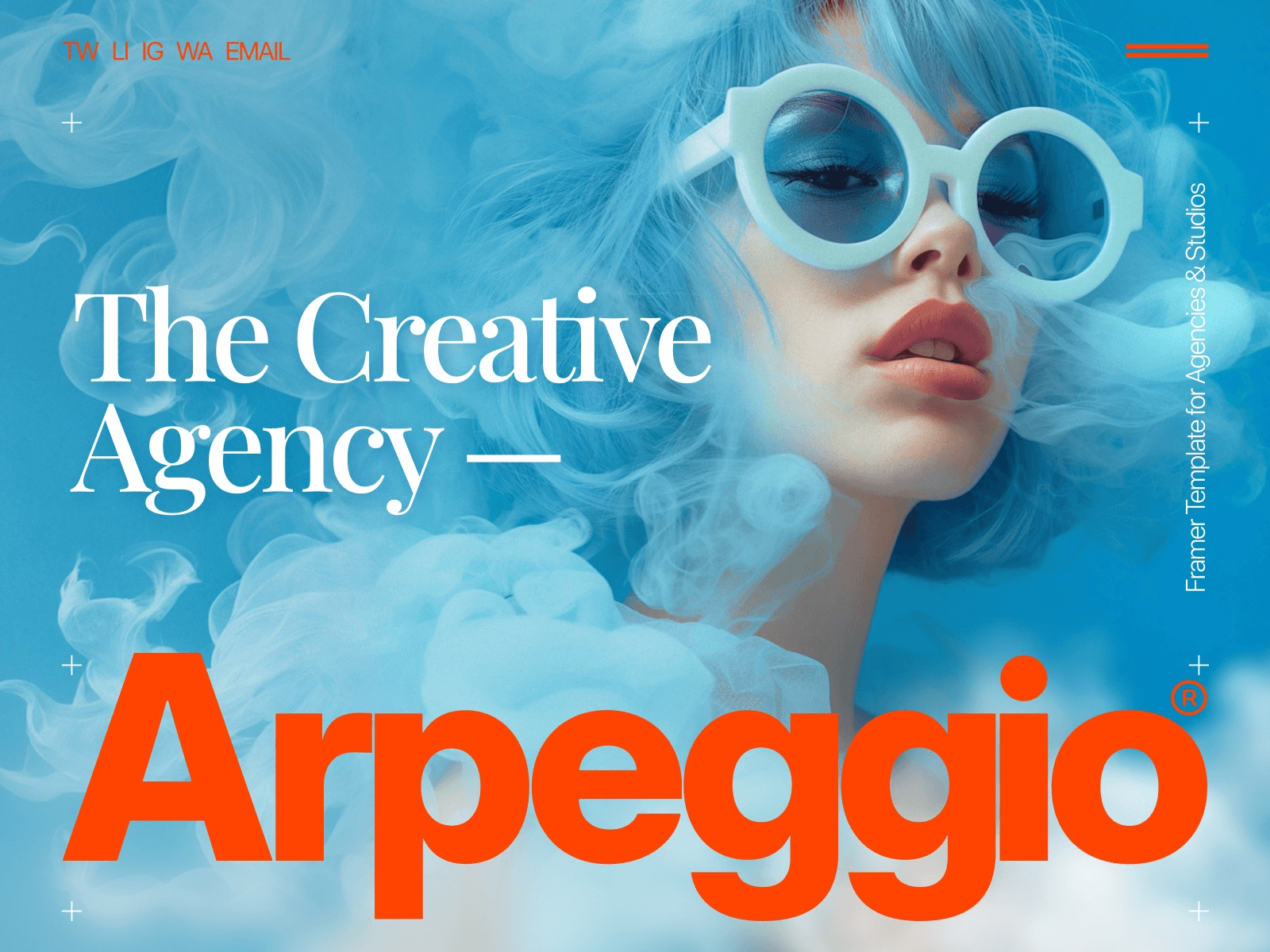
Free Creative Website Templates (Creative Category)
If you want your site to feel more expressive right out of the gate, the Free Creative Website Templates & Portfolio Designs category (by Framer) is where you’ll find templates that lean harder into visuals and personality.
Features: creative portfolio and showcase designs (free)
Creative templates often come with bolder layout decisions and a stronger “vibe.” They’re designed to make your work feel curated and intentional. One thing I like: they can help you commit to a direction. When a template has a clear visual system, it’s easier to build momentum.
Use case: creative portfolio and showcase sites
This category is great when your site is the product—or at least part of your brand. Think: studios, artists, photographers, experimental designers, or indie makers who want the site to have a point of view.
Pros/cons: strong visual impact vs. may prioritize style over traditional service pages
Pro: Instant style and uniqueness. Great for standing out.
Con: Some creative layouts can make it harder to communicate “boring but important” info like pricing, scope, or a step-by-step process.
Who it’s for: creatives who want a distinctive look quickly
If you choose a creative template but you’re still selling something (like a SaaS product or a service), I’d make sure you add clarity sections. For example, a crisp grid section (Frameblox-style) can help you explain benefits without killing the creative vibe—Bento layouts like Bento are especially good for this.
Free Professional Service Website Templates (Professional Services Category)
For agencies, consultants, studios, and service providers, the Free Professional Service Website Templates category (by Framer) is one of the most practical places to start. These Framer templates are usually built around conversion: clear offerings, credibility, and an obvious next step.
Features: service-business oriented structures (free)
Service templates typically have the fundamentals baked in: hero sections that explain what you do, service cards, testimonial areas, process sections, and a contact funnel. That structure matters because service sites fail when they’re vague—even if the design is pretty.
Use case: service business websites
If you’re building a site that needs to turn visitors into inquiries, this category is the shortcut. It’s also surprisingly relevant for SaaS teams building marketing pages, because a strong services layout is basically a strong “value proposition + trust + action” layout.
Pros/cons: helpful service layouts vs. may need customization for unique offerings
Pro: The structure is usually sensible and conversion-oriented.
Con: You may need to customize the specifics so you don’t sound like every other agency on the internet. Swap generic sections for your real differentiators.
Who it’s for: agencies, consultants, studios, and local service providers
If you’re tailoring one of these Framer website templates for a productized SaaS (like Frameblox), consider replacing “services” blocks with “features” blocks and using repeatable components to keep everything consistent. For example, if you’re using a template that has a weak error state or missing utility pages, having a clean prebuilt 404 page component ready can save you time and keep the experience polished.
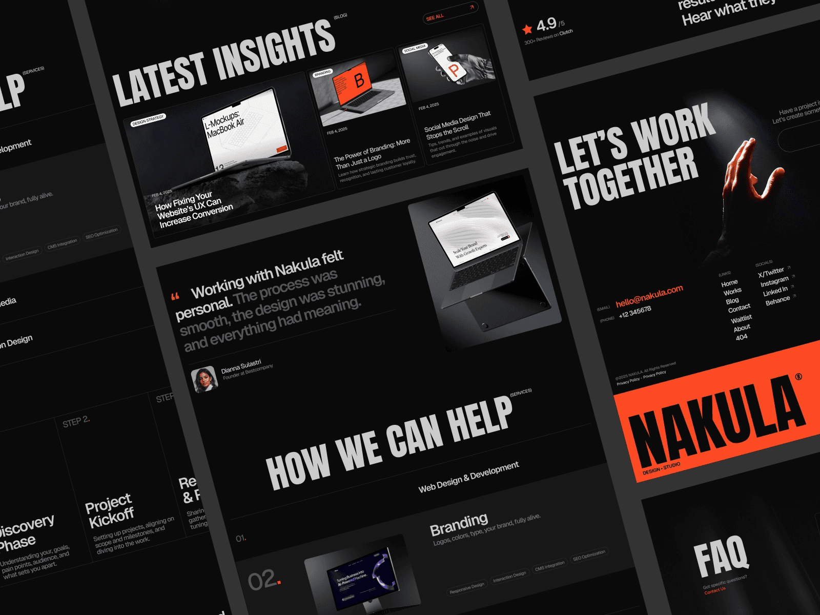
Free Black & White Website Templates for Designers (Black-and-White Category)
If you like minimalism—and you want your typography and spacing to do the heavy lifting—the Free Black & White Website Templates for Designers category (by Framer) is a satisfying browse. These Framer templates typically feel clean, editorial, and timeless.
Features: minimal black-and-white design styles (free)
Black-and-white templates force clarity. With fewer colors to hide behind, the layout, type hierarchy, and whitespace really matter. And when those are done well, the whole site feels “designed” without being loud.
Use case: minimal black-and-white design sites
This is a great category when your content is strong and you want the framing to feel premium: design portfolios, personal sites, simple product pages, or studio sites where restraint is part of the brand.
Pros/cons: clean and timeless vs. can feel too minimal for content-heavy sites
Pro: Hard to make it look messy. Minimal templates often age well.
Con: If you’re building something content-heavy (like lots of documentation or long-form posts), black-and-white can feel repetitive unless you introduce structure through components.
Who it’s for: designers who want a minimalist aesthetic
One thing to watch out for: minimal templates can accidentally become “generic.” If you go this route, make sure you bring a consistent design language—type scale, spacing tokens, and reusable blocks. If you’re building with Frameblox, starting from a solid foundation like Base can help you keep that minimalist feel while still making the site uniquely yours.
Free Responsive Templates & Landing Pages for News Sites (News Category)
Not everyone is building a portfolio or a marketing landing page. If you’re publishing regularly—news, updates, editorial content, magazine-style layouts—the Free Responsive Templates & Landing Pages for News Sites category (by Framer) is the right lane.
Features: news/magazine-friendly templates and landing pages (free)
News-style Framer templates usually focus on readability and scanning: lists, featured sections, grids, and pages that support lots of posts. They’re built for “more content, more often,” which is a different design problem than a single conversion page.
Use case: news and magazine sites
Use this category if your site needs to highlight new items frequently—like a newsletter hub, a media brand, or even a product update site. For SaaS businesses, it’s also a sneaky-good starting point if you want a “changelog meets blog” vibe where updates are the product story.
Pros/cons: suited to publishing formats vs. may be overkill for simple portfolios
Pro: Great information architecture for lots of content.
Con: If you just need a simple portfolio, this can feel like bringing a full kitchen to make toast.
Who it’s for: publishers, newsletters, blogs, and media-style sites
If you’re adapting a news template for a SaaS like Frameblox, I’d focus on turning editorial sections into “release notes,” “new components,” or “design tips.” Then use consistent blocks for showcasing updates—especially if you’re shipping frequently. And if you’re maintaining an older version of your site while iterating, it can help to reference something like Old Home as a baseline so your content stays aligned while the design evolves.

Free Website Templates (Free Website Templates Category)
If you want the broadest possible pool of free Framer templates without committing to a niche yet, start with Free Website Templates (by Framer). This category is basically the “I’m open-minded—show me what’s good” option.
Features: broad set of free general website templates (free)
You’re not locked into portfolio, news, or services here. That’s helpful when your site is a hybrid (for example: a SaaS marketing site that also needs a mini blog vibe, plus a community page). The variety can spark ideas you wouldn’t have found if you filtered too early.
Use case: free general website templates
This is my go-to when I’m building a new site concept and I’m still deciding what it “is.” For Frameblox-style SaaS pages, it’s useful because you can find a marketing-friendly template, then replace sections with your own design system components (feature grids, pricing areas, comparison blocks, etc.).
Pros/cons: lots of options vs. requires more comparison across styles
Pro: Huge variety. Great for brainstorming and quick shortlisting.
Con: Because it’s broad, you’ll need to compare across different styles. It’s easy to lose time if you don’t set rules for what you’re looking for.
Who it’s for: anyone who wants to start with free templates first
If you’re cost-conscious or just want to validate an idea before investing heavily, this is the most practical starting point. Pick 2–3 candidates, then test how easily you can swap in consistent sections—like dropping in code-friendly elements from Code if your site needs technical snippets, embeds, or dev-facing content blocks.
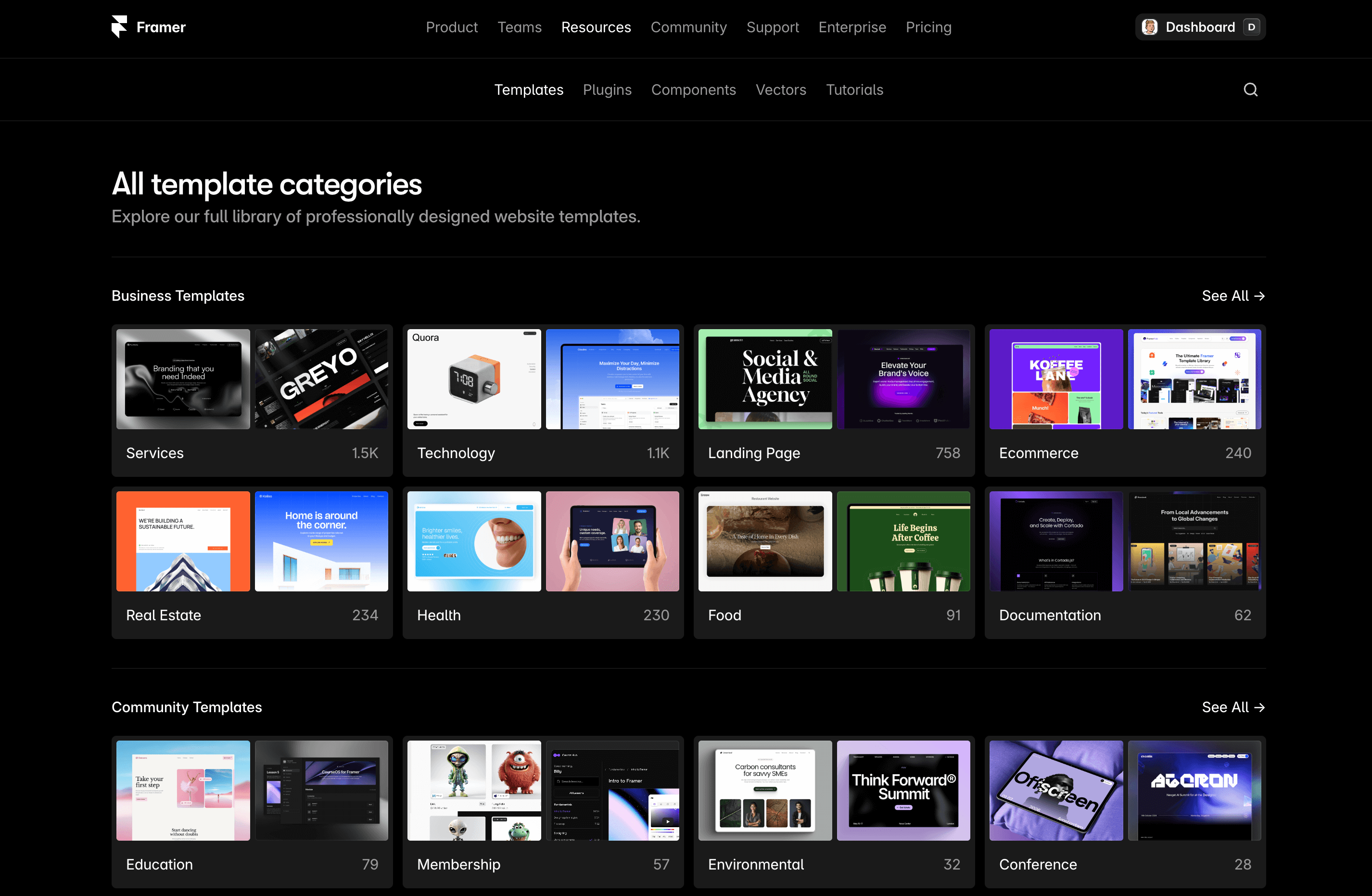
All Template Categories (Category Directory)
When you don’t want to scroll endlessly, use the directory: All template categories (by Framer). It’s free, and it’s honestly the fastest way to get your bearings.
Features: category browsing across template types (free)
This page is basically your map. Instead of guessing search terms or relying on whatever the algorithm surfaces, you can browse template categories intentionally. That’s a big deal if you’re trying to be efficient and not get pulled into “shiny template syndrome.”
Use case: browse template categories
Use it when you know the kind of site you’re building but you’re not sure what Framer calls it. Sometimes what you think is a “startup” site is actually best served by professional services layouts, or what you think is a “blog” layout fits better in a news-style category.
Pros/cons: fastest way to narrow intent vs. you still need to evaluate individual templates
Pro: Quick narrowing. Less time wasted browsing irrelevant Framer templates.
Con: Categories don’t choose for you—you’ll still need to open templates and judge structure, not just aesthetics.
Who it’s for: people who know the kind of site they’re building and want the right category
This is especially helpful if you’re building multiple pages for a product ecosystem. For instance, a SaaS business might need a marketing site plus a community area. Starting at the category level helps you avoid forcing one template type to do everything.
Community Website Templates (Community Category)
If you’re building a hub for members, a creator community, or a group-based experience, the Community Website Templates - Framer Marketplace category (by Framer) is the most relevant place to start. These Framer templates tend to feel like “places” rather than just landing pages.
Features: templates geared toward community/membership sites (free)
Community templates typically prioritize navigation and sections that make sense for ongoing engagement—areas for updates, onboarding, membership info, and calls to participate. Even if you’re not building a full community product, these layouts can be great if you want your site to feel more interactive and less brochure-like.
Use case: community and membership sites
If you’re running a membership, a learning group, or a product community, this category helps you start with the right mental model. And for a SaaS brand like Frameblox, it’s relevant because community and product often overlap: updates, shared resources, and member perks can live side by side with marketing pages.
Pros/cons: aligned to community needs vs. may not fit one-page marketing sites
Pro: Built around participation and retention, not just first-click conversions.
Con: If you just need a simple one-page marketing site, community templates can feel like extra scaffolding.
Who it’s for: creators building communities, groups, or membership-style experiences
My advice: if you choose a community template, be intentional about simplifying it if needed. Keep the parts that support your goal (onboarding, updates, resources) and cut anything that doesn’t. Then standardize your UI elements so the whole site feels cohesive—having a consistent component library helps a ton when your site has more “moving parts.”
How to Choose the Right Framer Template Category for Your Site
The best Framer templates aren’t necessarily the prettiest ones—they’re the ones that match what your site needs to do. A template is a structure decision before it’s a styling decision. If you pick the right category, you’ll spend your time customizing content and brand instead of fighting the layout.
Match your primary goal: portfolio vs. services vs. news vs. community
Portfolio: Choose portfolio templates when your work is the proof. Great for case studies and visual storytelling.
Creative: Choose creative templates when your site needs to feel expressive and distinctive fast.
Professional services: Choose services templates when you need clear offerings and inquiries (or a marketing site that behaves like a conversion funnel).
News: Choose news templates when you publish often and navigation + readability are the priority.
Community: Choose community templates when the site is a hub—resources, onboarding, updates, participation.
When to start broad (Free Website Templates) vs. start specific (Portfolio/News/etc.)
Start broad with Free Website Templates when:
You’re still deciding what the site “shape” should be
You want inspiration across multiple template styles
You’re validating a new offer quickly (fast prototype, low commitment)
Start specific (Portfolio/News/Services/Community) when:
You already know the site’s main job
You want to compare options that solve the same problem
You want to reduce decision fatigue and ship faster
A quick checklist to shortlist 2–3 templates before customizing
Before you commit, shortlist 2–3 Framer templates and do a quick reality check:
Does it have the right pages? Or will you need to add multiple pages from scratch?
Is the navigation sensible? If users can’t find key info quickly, the design doesn’t matter.
Can you swap sections easily? If you plan to use a design system (highly recommended), you want a template that’s modular.
Does it fit your content volume? Minimal templates can struggle with lots of content; news templates can be too heavy for simple sites.
Will it support your brand system? If you’re planning a consistent UI (buttons, cards, typography), you want a structure that won’t fight you.
For Frameblox users specifically, I’d also ask: “Can I quickly replace the template’s sections with consistent, reusable components?” If yes, you’re in a great spot to build fast and still look like you designed everything intentionally.
Your Next Steps: Pick a Template, Customize, and Publish
Once you’ve found a couple solid Framer templates, the key is to stop browsing and start building. Browsing feels productive… but publishing is what actually moves your project forward.
Decide your category and shortlist options
Pick the category that matches your goal, then shortlist 2–3 options. If you’re unsure, start at Framer Marketplace and move toward the category pages once you’ve got direction. If you already know what you need, jump straight to the relevant template category and save yourself time.
Customize structure and content to match your use case
Customize in this order:
Structure: pages, navigation, section order
Content: headlines, body copy, screenshots, case studies
System: typography, spacing, buttons, cards—make it consistent
If your site is growing into multiple pages and reusable patterns, lean on a system early. A library like Frameblox helps you avoid the “every section looks slightly different” trap that happens when you remix a template too casually.
Publish and iterate after launch
Publish as soon as the site communicates the essentials: what it is, who it’s for, and what to do next. Then iterate based on what you learn. If you keep tweaking forever, you’ll never ship.
Practical advice: choose a template category that matches your intent, then choose the simplest template that already has your core pages and layout logic. Style is easy to adjust. Structure is what saves (or costs) you days. Once you’ve got that structure, you can bring in consistent sections and UI patterns—so your final site feels less like “a template” and more like a real product experience.
This article was created using Blogie.